By: Chris Kunstadt, Senior Graphic Designer
There are many ways to maximize great photography, however when it comes to branding, sometimes it’s little tricks graphic designers use that really take photography to the next level. For this month’s #TipTuesday, join me as I demonstrate how you can utilize Gradient Maps to homogenize a wide variety of photographic styles.
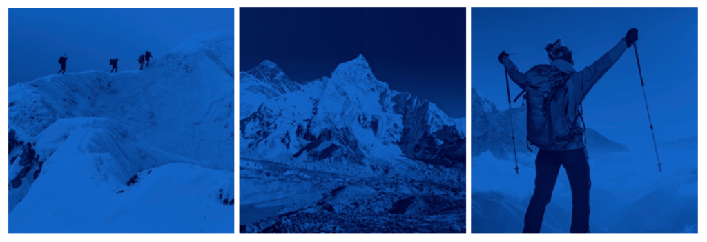
The Gradient Map applies the gradient by using the lightness and darkness values in the image as a map for how the gradient colors are applied. In my first example, shown in the images below, the subject matter is all related, however in the original images, the color palettes, exposures, and white balances differ. This set was created for the Everest Apothecary website. It worked well to have a single blue-to-nearly-black Gradient Map to colorize them. The pages had other colors and things going on so the consistency of the blue masthead images within each section worked nicely to convey the overall brand throughout the website.
The next set of images below shows another approach, whereby ONE portion of the Gradient Map is consistent throughout, and the other varies. As long as the “set” color is not black, that color will anchor the effect and make the variably colored images look coordinated. In this example that we created for one of our clients, we chose a navy-blue color pulled from their logo as the Set/Shadow color. The other colors are of similar saturation but, clearly, run pretty far across the spectrum. Again, the original (stock) photos are all very different in the way they were captured. By knowing the photos will be colorized and coordinated in the end, we could concentrate on finding the composition and subject matter that we were after. We did not need to choose photos from the same photographer or even Stock photo site. The photos relate well to each another and with the addition of other consistent branding elements (logo, typestyles), this can make for a lush and extensible campaign.

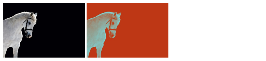
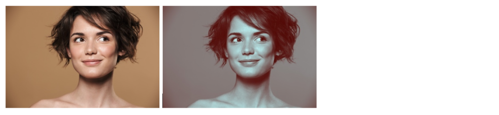
When looking at stock photo styles, I recommend choosing photos that are higher in overall contrast – that way the pure colors of the Gradient Map are revealed. In other words, both of the colors in the gradient map are shown without much of the other interfering. As an extension of this idea, it’s nice to have photos that use a large field of either black or white. These fields create a great platform of color out of which the opposite color can pop. If the photo has a lot of mild-tones, both (or all) colors in the gradient map will always be blended and can result in a muddy image without much graphic appeal. Below are examples of how this is done well and not so well.
Good Example – high contrast, large black and white field, gradient map stands out:
Bad Example – Mild color tones, gradient map blends together:
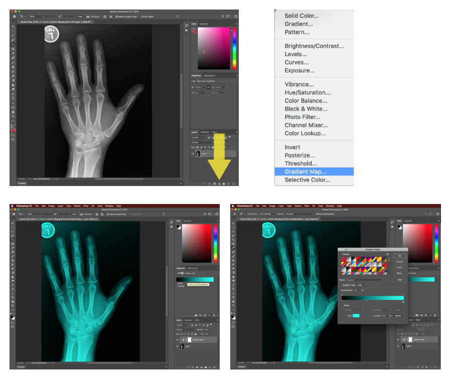
If you are trying out this #TipTuesday for the first time, the images below map out how to create this style in Photoshop. Give it a go—the best way to see how the Gradient Map tool works is to try it out!